
About a year ago I became interested in a field called Data Visualization. It's about as straight forward as it sounds. With so much data on so many things there is a serious need to sift through all of it. The greatest part is that the process of sorting brings together artists looking for inspiration and scientists looking for demonstration and, of course, provides the oppurtunity to be both.
One of the biggest problems with the massive data sets the human species is accumulating is that we are losing our ability to comprehend magnitudes. The sheer size of numbers prevents us from grasping their meanings. 24-hour news sites broadcast facts and figures from study after study, throwing numbers all over the place, but do you really have a concept of how big one million actually is? As a physics major, I deal with extreme orders of magnitude every day and I have no idea how small a billionth of an inch is, let alone quantum effects on the order of 10^-34. Thats 34 0's:
.00000000000000000000000000000000001
That doesn't mean anything to anybody.
This is a problem because it means people can stand up and shoot off figures knowing that they won't be challenged because no one knows what they mean to begin with. The most annoying example that comes to mind is something you are hearing more and more often. Carbon emissions. Now, I want to be clear, I believe in global warming, I believe in climate change, I believe humans are LARGELY to blame, but what I don't understand, are their numbers. A standard quote goes something like this, "Leaving your cell phone charger in releases 100 tons of C02 into the atmosphere!" 100 tons! Thats like 50 cars! That makes no sense at all, what kind of volume does that 100 tons take up? Now, I realize here that I am making myself look like an idiot because thats clearly not what 100 tons of C02 really is, but the point is if I don't know, I guarantee a lot of people don't know. People have no concept of what these numbers even mean.
But this post isn't about being cynical or angry at people, I am just trying to motivate the need for work in data visualization. When you hear statistics like "Americans use 'insert large number' cans per year." You should think, "Well how many is 'insert large number' cans? Thankfully, Chris Jordan will help you:

This is two million bottles (2,000,000) the number of bottles used in the US every five minutes...a lot...but you can see it.
I strongly encourage you to check out more of Chris Jordan's work to help give meaning to these statistics:
http://www.chrisjordan.com/
So coming up with good ways to represent data is a good thing, but data visualization is also about making relationships come to the surface. Relationships that would not have been visible before. Chris Harrison (note, all good data visualizers are not named chris), a PhD student at Carnegie Mellon has produced some of the most amazing data visualizations I have ever seen. Perhaps the most striking is work he did exploring relationships in the Bible.
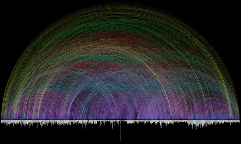
The bar graph that runs along the bottom represents all of the chapters in the Bible. Books alternate in color between white and light gray. The length of each bar denotes the number of verses in the chapter. Each of the 63,779 cross references found in the Bible is depicted by a single arc - the color corresponds to the distance between the two chapters, creating a rainbow-like effect.
The entire set of visualizations, and super-super-HUGE versions of that picture can be found here:
http://www.chrisharrison.net/projects/bibleviz/index.html
And again, please look over more of Chris's work:
http://www.chrisharrison.net/
You can see the enormous power of data visualization to give insight into relationships that could not be found by simple eyeballing these huge data sets. The most amazing this is that these relationships are as wonderful because of their meaning as they are for the inherent beauty they display. All of these unbelievable symmetries and details are sitting right there if you know how to highlight them.
For lack of time, i'll turn to a final example of a data visualization technique that resonates (no pun intended...ok maybe a little) with me. I have a foundness for music and just about anything audio. Being an auditory learner and the type of person who always has headphones on, playing a soundtrack to my life, it is no surprise to be attracted to any new way of expressing music or sound. To be clear that this is relavent, sound is just data. Sparing you from the gory details, sound is just pressure waves in the air which hit something called a microphone. The microphone takes these pressure waves and converts them into electrical signals that a computer can process. Speakers then, act as reverse microphones, taking the audio data and vibrating to repoduce the pressure wave.
So wouldn't it be cool if you could take that data and do something else with it? Well people have. The best example I have is something I just stumbled across about a week ago and was awe-struck. A graphic designer named Robert Hodgin made this:
Weird Fishes: Arpeggi from flight404 on Vimeo.
Again, I will spare you the details, but basically you write computer code which analyses the sound data and they serves are sort of a conductor for the program to create visuals. The most amazing thing about this video is that it is NOT NOT NOT animation. What you are seeing is a computer programming that is reacting ONLY to the audio. Another way to think about it is having a physical system with lots of particles floating around. Those particles travel on trajectories based on some fundemental laws and initial conditions (how hard to kick them). The program is the laws, and you use the music itself to provide the initial conditions. It is a way of allowing inherent qualities of the music to drive creativity in an entirely different medium. In this case, sound is creating sight.
This is Robert Hodgin's blog, which gets into a bit more about the creative process behind this. Incidently, he is the creator of the new iTunes Visualizer (open the newest version of iTunes, play a song, go View - Show Visualizer).
For more cool stuff like this, check out this site, which uses similar principles to explore the phenomena of Synesthesia. For those curisious, synesthesia, is a condition where the auditory nerve is connected to the optical nerve in such a way that people actually see things like colors or shapes when they hear music. As another tangent, the Nobel Prize winning physicist, Richard Feynman, said that he had some form of this, but with solving equations, as if he could analysis equations by seeing different parts as different colors.
Well that took probably as long to write as it would have to go take some more pictures, but I hope you found it interesting. If you find any spelling or grammatical errors, sorry but I don't care, I think you get what I am writing about.
I leave you with a more humorous, but none the less insightful data visualization:
It never ends. For those looking for a blog devoted entirely to this sort of stuff, check out:
http://infosthetics.com/
**EDIT** Gah i keep forgetting really great things. I came across this blog today which i found hilarious, and is a great example of how powerful simplicity can be. I will add the link to my blog list at the bottom of this page.
http://indexed.blogspot.com
No comments:
Post a Comment